Rustic (Hot Cross Four)

When I posted the first art piece in the Hot Cross series, Crossroads, I requested input and constructive criticism.  I’m grateful for what I received.  My brother, in addition to his comments, also presented me with a challenge:

He wrote: “I’m hoping one uses mixed media of some sort to look like a rustic cross made from the wood in an old barn… Consider that a challenge put forth.”

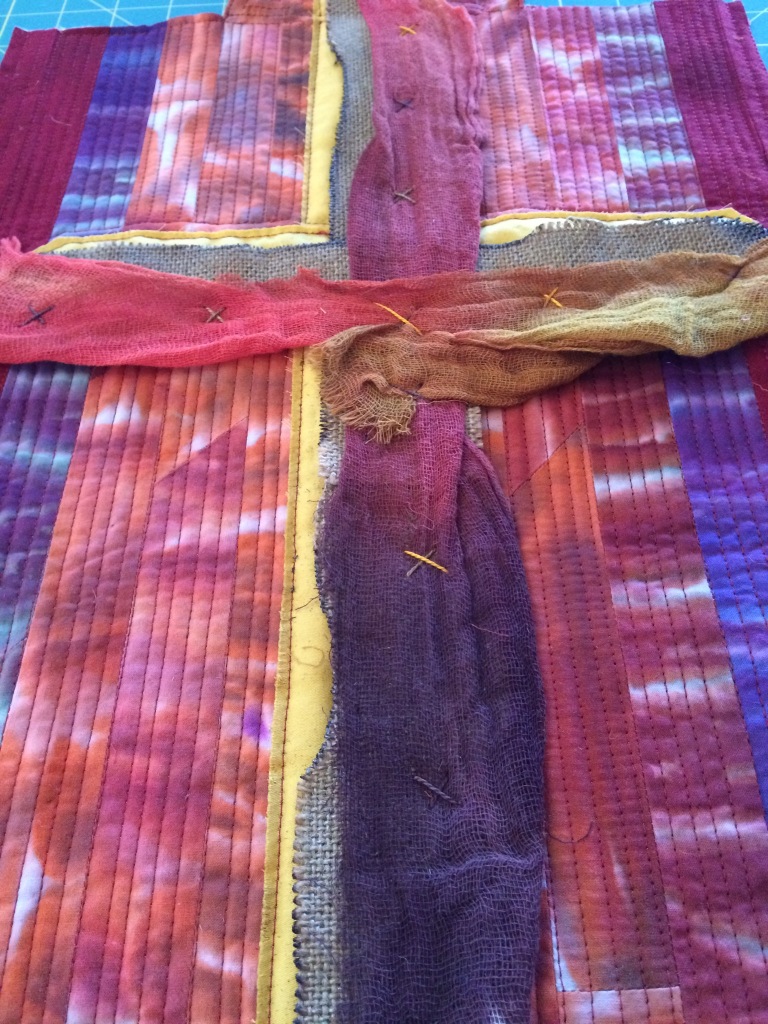
To my mind and my eye, Rustic doesn’t look like wood or an old barn, but the colors are indicative of those weathered structures one sees when traveling down a lonely rural road.

Rustic (Hot Cross Four) 01
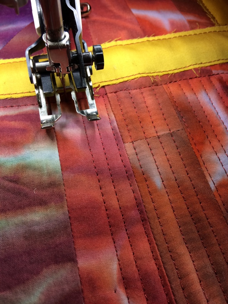
Quilting away
Rustic (Hot Cross Four) 02
Texture
Rustic (Hot Cross Four) 03
Closeup
Rustic (Hot Cross Four) 04
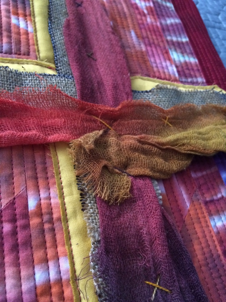
Closeup and texture
Rustic (Hot Cross Four) 05
Rustic: The completed piece
Rustic (Hot Cross Four) 06
Poetry label

This piece incorporates burlap, with burnt edges, and hand dyed cheesecloth (not mine…created by Frieda Anderson – http://www.friestyle.com/ ).  The burlap and cheesecloth were anchored with single cross stitches using hand dyed embroidery thread (also not mine…created by Laura Wasilowski – http://artfabrik.com/ ).  My Sweets suggested I extend the strip piecing beyond the edge of the quilt at the top and bottom of the cross to imply rough and rugged edges.

I’m not quite sure I like the final impact of those extensions, however, since this art piece began as a challenge from my brother, I incorporated Sweets’ suggestion as an additional out-of-the-box effort.

Please let me know what you think.  All input and constructive criticism is appreciated.

Rustic (link to poem)

Next up: A break from the Hot Cross series, but I’ll back to it soon.

Resurrection (Hot Cross Three)

It seems appropriate that I finished the third art quilt in my Hot Cross series during Easter week.  The timing is pure coincidence, but providential.

Resurrection depicts an abstract figure fused to the cross, which was fused to the background.  The piece called for free form quilting rather than the linear stitches in the previous pieces.

Once again, I’d appreciate any input or constructive criticism in the comments.

Resurrection (link to poem)

Resurrection (Hot Cross Three)
Resurrection
Resurrection (Hot Cross Three)
Closeup
Resurrection (Hot Cross Three)
Poetry label

Next up: Rustic (Hot Cross Four)

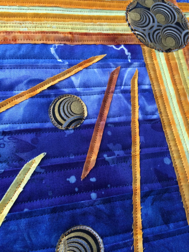
Blue Radiance (Hot Cross Two)

In my second to last post, I mentioned I am working in a series this year as a means to help define and find my artist’s voice.  I chose crosses because they visually appeal to me.  There are so many styles depending on the source.  Just Google “crosses” and you’ll discover image upon image of plain, ornate, Coptic, Celtic, colorful.

I also chose this theme because there are so many ways to shake up that linear shape.  I’m curious to see how many versions I can create.

Blue Radiance appears below (I was going to name it “Study in Blue”, but the final piece called for a different name).

Just like last time, I’d appreciate any input or constructive criticism in the comments.

Blue Radiance (link to poem)

Blue Radiance (Hot Cross Two)
Full piece – 12″x18″. Thoughts?
Blue Radiance (Hot Cross Two)
Closeup #1
Blue Radiance (Hot Cross Two)
Closeup #2
Blue Radiance (Hot Cross Two)
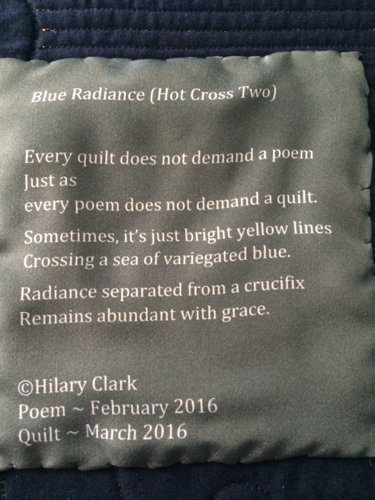
Poetry Label

Next up: Resurrection (Hot Cross Three)

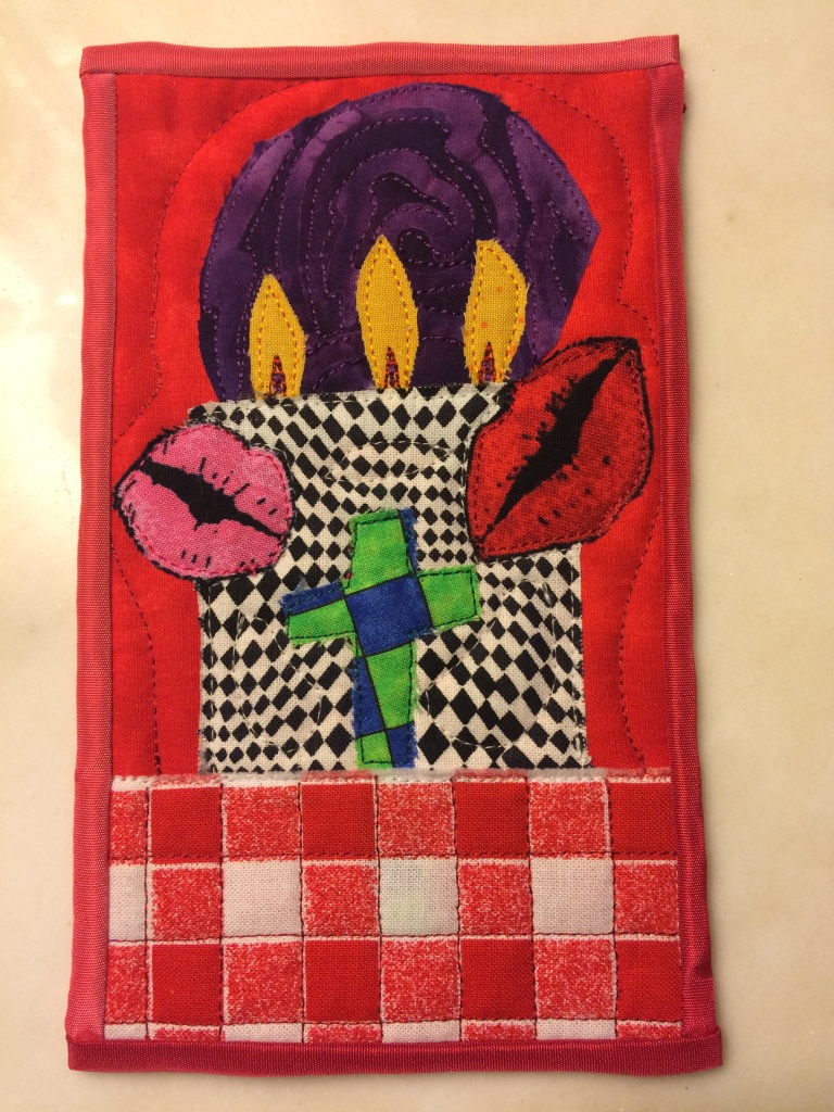
Light for Yvonne

In late January, SAQA sent out a request for 4″ x 6″ postcard quilts depicting candles for light in support of and encouragement for Yvonne Porcella. She is the founder of SAQA (Studio Art Quilt Associates).  She is also family.

I made this one on a Friday night and shipped it off for inclusion in the collection to be forwarded on to her. This wasn’t on my list of “planned” art. I’m such a planner type person that means something. However, the request — a physical prayer for Yvonne’s health — provided appropriate inspiration. The experience of designing on the fly in my head one afternoon, then making a quick stop at the fabric store for the black and white check (her signature fabric), then getting home and spending the next three hours putting this together was exhilarating. I didn’t know I had it in me to make art that way.

I have always considered Yvonne and her sister, Marilou, to be “aunts” more than the cousins they are.  I believe this is because they are “double cousins” to my mother — their fathers were brothers and their mothers were sisters.  My mom is an only child, so if I was going to have aunts on her side, those two seemed the most logical choice.  A child’s brain often creates connections that click and never break, regardless of the vast number of years that pass.

My mom taught me to sew and to embrace color, to revel in color.  I owe her for my interest in quilting and I am grateful for that.

From Yvonne, I learned that quilts could be art, that they didn’t need to be traditional, that rules are made to be broken, that the only rules necessary are those that allow the imagination to soar free.  I am grateful for that as well.

****************

On Friday, February 12, 2016, Yvonne passed away after a 6-year battle with cancer. Her fight was valiant and seemingly fearless.  Her zest and her spirit were never diminished.  She was, and is, loved.  As long as her family, her friends, remember her, as long as the art quilt survives, her light will not go out.

Light for Yvonne
Light for Yvonne

She was laid to rest today, Friday, February 19, 2016.  As her youngest son, Don, an artist in his own right, so beautifully stated, she has gone to her “studio in the sky”.

Rest in peace, Yvonne.  ❤

Crossroads (Hot Cross One)

Each year, I set goals for myself related to my art.  I don’t do resolutions.  I do goals, with defined steps leading to achievement.  This works best for me — I tend to reach the end to which I strive.  In keeping with my updated goals for 2016, my focus for the year is to make twelve (12) art quilts.  This will help to develop my work ethic, a body of work, and to find my voice.  My art “voice” is sort of all over the place; the best way to find it is to keep making art.

For the first part of this year, I decided to work along a theme to see if that helps to clarify my voice.  To that end, I’m making a series of crosses — one is done (see below), the second is in progress, and a third is in the sketchbook.  I’d like to make six in the series.

Please help…What do you think or see or feel when you look at the photo of the art quilt above?  Does this visually resonate?  Is the piece soothing and satisfying or jarring, incomplete, unsettling?  Your input will go a long way towards helping me understand

Crossroads (link to poem)


Crossroads (Hot Cross One)
What do appeals to you about this piece? What don’t you like?
Crossroads (Hot Cross One)
Closeup #1
Crossroads (Hot Cross One)
Closeup #2
Crossroads (Hot Cross One)
Poetry Label

Next up: A Study in Blue (Hot Cross Two)