
Back in the early days of office computers — sometime after Windows became the standard operating system — I would find myself opening the accessory program, Paint, if I found myself with a little down time.
I loved Paint. I would pick the fat little brush tool, any one of the colors, and make wild swirls across the stark white background. Then I’d pick another color and do the same thing over the first color. Then another color and another and another until the computer screen canvas was saturated with this great jumbled abstract “painting”.
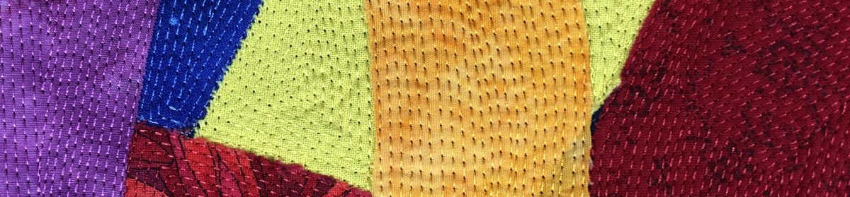
Sort of like this, although the old ones I used to draw didn’t leave any room for the page to peek through:

When I returned to art quilting, an abstract work, reminiscent of playtime in Paint, was one of the first things on my design idea list. When I received word that my SAQA region would be hosting an exhibit entitled “Stitched Together”, I knew the time had come to make an abstract piece to submit for the call for entry.
I grabbed all my strips and some of my scraps and some ribbon I had stored away. I began laying them out in a random pattern on a piece of muslin. When I was satisfied, I fused all I could, then turned to the machine to stitch the pieces down. I also used a few different stitch types — satin stitch, T stitch, buttonhole — for variety to produce random chaos.
Once quilted and stitched, but not finished, I discovered this work disturbed me on a visceral level. Looking at the wild splashes of color, my OCD self itched. I was not sure I liked what I’d made so I posted a photo on Instagram and Facebook, admitting defeat, which is big deal because I always finish my work (my OCD again). The response was interesting. One person suggested turning the piece 90 degrees, which did improve the piece but then didn’t fit the dimensional requirements for the call for entry. Another (my Mom) suggested adding black and white. A third said she loved the piece just as it was…it reminded her of a carnival or fair.
I took my Mom’s suggestion to include black and white. The older I get, the more I listen to her. Funny how that works. 🙂
Once I’d completed the additions, I realized the piece had been salvaged. I posted another photo, received more comments, and came up with the name for this piece when one person wrote the black and white additions made her feel she was looking through a screen door at a summer garden. Another viewer wrote the piece reminded her of Piet Mondrian’s work, which I really appreciated because I like his work and in fact, have a few photos of his work in my design idea folder for inspiration.
I’m going to enter this piece in the call for entry. Accepted or not, it was always worth making.
As always, I’d appreciate any input or constructive criticism in the comments.
Summer Garden (link to poem)


Next up: A piece about living a bright life

Still waiting on my Rangers Ballpark quilt… They’ve announced a new stadium for 2021, if the Arlington voters approve it in November. I don’t want a quilt of the new stadium, so I’m creating a “call for entry” to have you complete this before the new stadium opens.
Side note about “Summer Garden” – I would have titled it “Screen Door” – your poem is great, but the imagery of the poem and the quilt fit the “Screen Door” title better, IMO.
LikeLike
Well, shoot. You are right about the name. Argh. Screen Door resonates more strongly. Oh well, I can change it.
As for your call for entry, get me some specs. Photos, what you’d like, etc. I need inspiration! You know ballparks aren’t my thing. 😜
LikeLike
I’ll email your some photos of the Ballpark… 🙂
LikeLike
you, not your… Dammit!
LikeLike
Nice to see this work completed. I know you struggled with it but in the end it turned out to be an interesting piece. I think I agree with Phil’s assessment of the title – Screen Door – seems to fit the label and pic better. Also thanks for the compliment about finding out that my suggestions are worth listening to!! I’ve waited a long time to hear that!! LOL Good luck with the submission. Love, Mom xoxoxo
LikeLike